The Parable of the Messy Map
My job, for most of the past six weeks, has been to align cryptic old maps with existing digital data, so that points labeled in small, blurry fonts can be entered into a database. I am not going to show actual screenshots of my work – even if I gave away no useful information to the opposing legal team, it would be bad luck – but here is an artist’s impression:
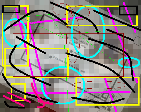
Extracting information from this pathetic excuse for a usable map is, in fact, a learned skill. I only realized this a couple of weeks ago, when I sat down with the company’s graphic designer to show her how to do what I was doing. She was impressed at my ability to rapidly find relevant landmarks in the Pollockian heap of worms and pink spaghetti on my screen.
While we were going over the technical details, she made an offhand comment about turning the different image layers different colors, instead of looking at several layers of gray on gray. That’s not hard to do, but the relevant knob is squirreled away under a couple of option panels; I showed her where it was and turned my base map light blue, as an example.
And lo, my life became much easier.
Learning to work with a poorly-designed system is kind of a waste of effort.
If you put Edward Tufte in an empty pot, and slowly add chartjunk, will he leap out before he is boiled alive?
jake wrote:
I spend most of my time making maps. I am sometimes given a poorly copied PDF consisting of a road, a property boundary, and maybe some points… Keeping in my mind that my goal is always to leave abundant evidence that what I have made is correct (which is often take for granted…), I begin by importing the PDF into a photoshop-type program. From there I strip out anything that is not relevant and make the background transparent, then I export it as a transparent .gif. Then I start up ArcMap and create a project with USGS Topo Quad layers, as well as aerial photo layers. I import the transparent .gif and stretch it over the topo and the aerial until it makes sense. Then I can create new shapefiles by tracing the relevant lines and points in the .gif. It’s quick and dirty, but without the luxury of lat and longs, it works.
Posted 19 Mar 2020 at 9:54 am 
Isis the Scientist wrote:
I had a shirt with that same pattern in the 80s.
Posted 19 Mar 2020 at 9:54 am 
Maria Brumm wrote:
Isis: Me too! And I was an impressionable youth during the 80s. Perhaps that is why I became a GIS monkey.
Posted 19 Mar 2020 at 11:32 am 
bioephemera wrote:
Hey! No torturing Tufte on my watch!
Posted 19 Mar 2020 at 11:32 am 
Matt Wedel wrote:
Learning to work with a poorly-designed system is kind of a waste of effort.
In Neal Stephenson’s Anathem, errant intellectuals are punished by being forced to memorize pointless or flawed information. The more serious the offense, the more the argument seems to work but is actually cryptically flawed.
He didn’t say whether this was inspired by any particular operating system or piece of software…
Posted 19 Mar 2020 at 4:15 pm 